Glossier UI Kit
As a designer eager to build my own work, I challenged myself to learn HTML and CSS by replicating Glossier's Product Details Page, translating a real design system from Figma into a fully coded UI Kit.
Role:
Designer & Developer
Timeline:
2 Weeks
Outcome:
Frontend Component Library (HTML/CSS)

Introduction
As a product designer, I have always been eager to bring my designs to life beyond the constraints of design tools. This project was a self-initiated exercise undertaken during my "Design for Digital Systems" course at Carnegie Mellon University (graduate school), where I challenged myself to learn the fundamentals of HTML, CSS, and JavaScript by replicating a real-world product interface from scratch.
The scope of this exercise was to build key components of Glossier's Product Details Page, a design I admired for its clean, systematic visual language. Rather than jumping straight into code, I approached this as I would any design problem: methodically, starting with a understanding of the system before building it.
In doing so, I took a deep dive into design systems, CSS variables, and atomic design principles — areas that sit at the intersection of design and engineering. The process as a whole reinforced my understanding of design-to-code workflows, flexbox, and CSS animations, and gave me a clearer perspective on what it takes to bring a design system to life in the browser.
Process
1
Analyzing the design system
Before writing a single line of code, I stepped back and analyzed Glossier's Product Details Page at a systems level. I identified the foundational visual elements, such as color, typography, and spacing, that were consistently repeated throughout the page. This audit informed the design token architecture I would later translate into both Figma and CSS.
2
Setting up design tokens in Figma
With my observations documented, I moved into Figma to leverage its "variables" feature, which allows designers to store values, such as strings, numbers, colors, and booleans, as reusable design attributes. I structured the tokens using the following framework:
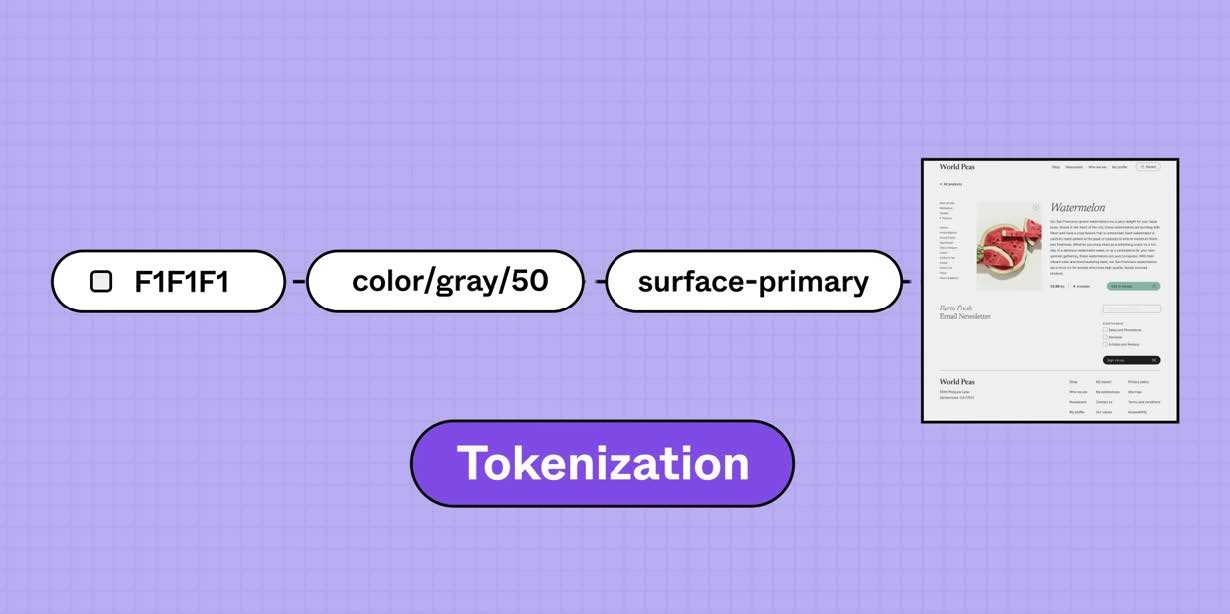
[Value] → [Primitive] → [Token]
First, I defined a set of "primitive" variables to establish the raw color and spacing values. I then mapped those primitives to semantically named "token" variables. This approach proved invaluable: rather than hunting for a specific hex code each time, I could reference a token by name and update its value globally from a single location.
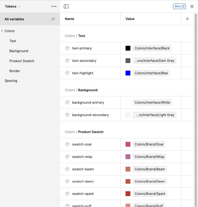
Since Glossier's website uses the licensed typeface "Apercu," I substituted it with the visually similar "Lato" and defined a corresponding set of local font styles for both desktop and mobile, covering headers and body paragraphs.
3
Replicating components using atomic design
With the design foundations in place, I replicated the components in Figma before attempting to build them in code, a deliberate choice that allowed me to think through structure and hierarchy without the added complexity of syntax. I applied the atomic design methodology to break down the interface into manageable layers:
Atoms: Badges, tags, selectors, color swatches, and buttonsMolecules & organisms: Accordions, drawer content, product cards, and media cardsTemplates: Grouped accordions, drawers, and product/media cards
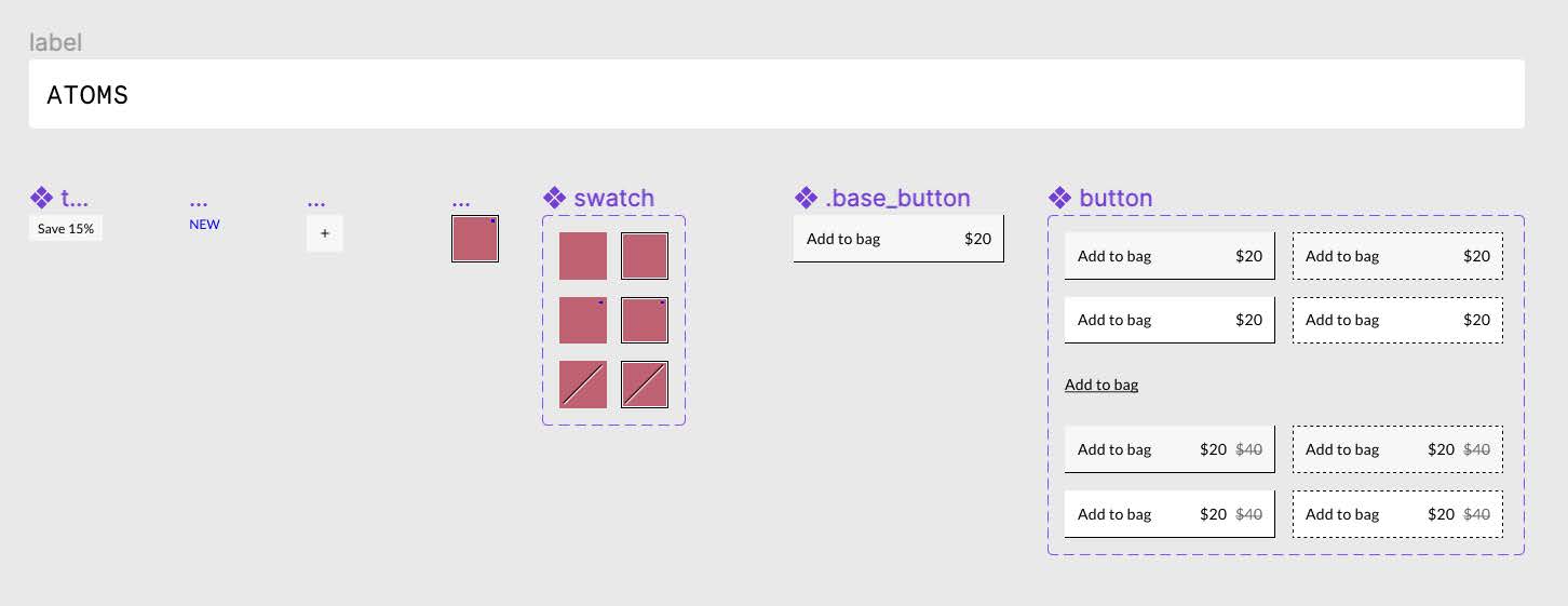
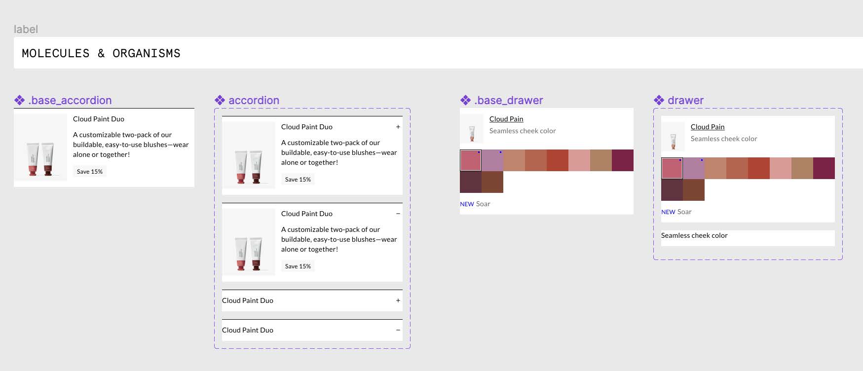

Building from the smallest units upward gave me a clear, organized path through the components and established a consistent naming and structure convention that carried directly into the code.
4
Translating tokens into CSS variables
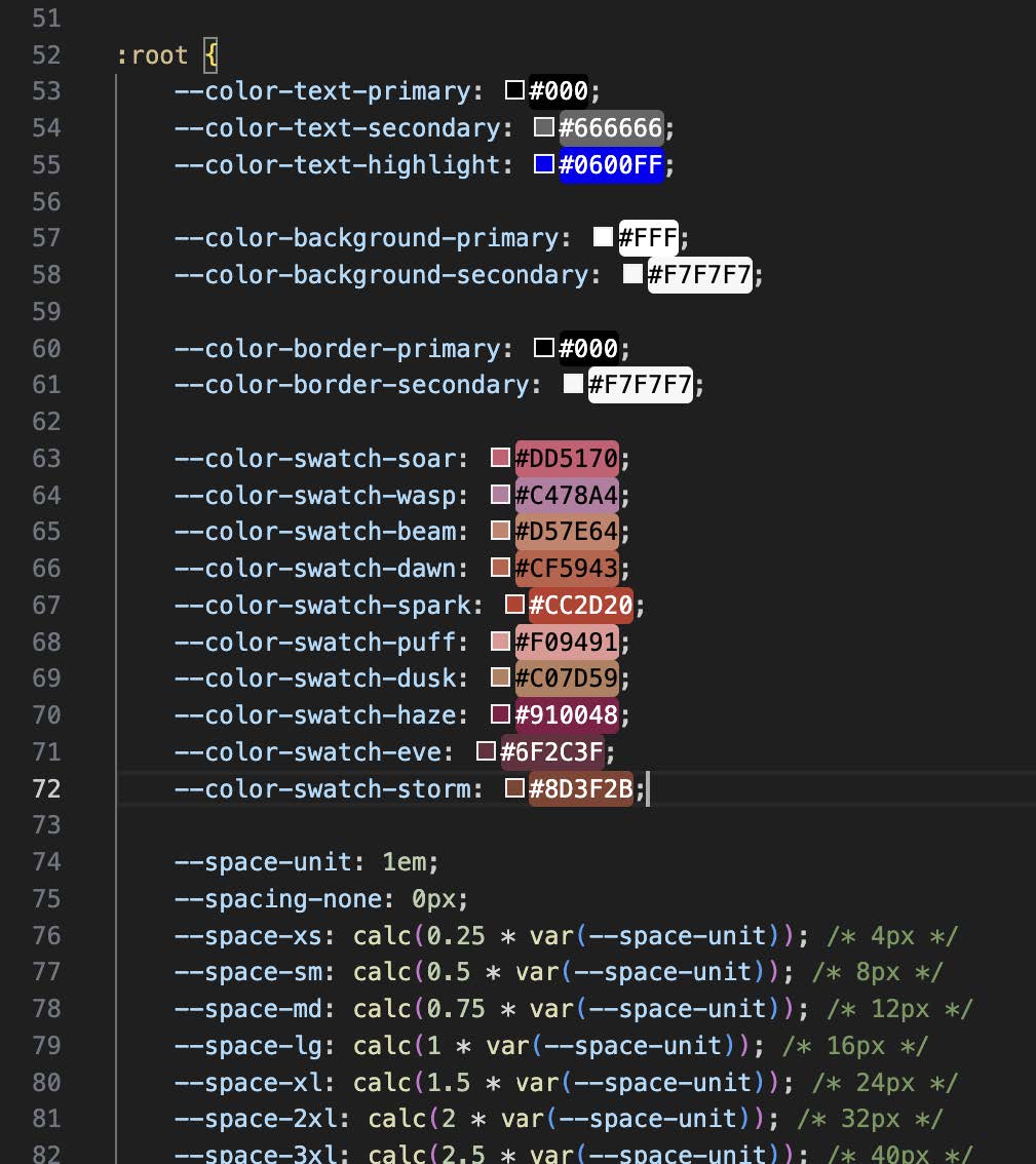
Transitioning into code, I first established the design tokens as CSS custom properties (variables), mirroring the token structure from Figma. This made the stylesheet significantly easier to maintain, because color and spacing values only needed to be defined once and referenced throughout. While I found typing the var() function repetitive at times, the consistency it enforced was well worth the tradeoff.
5
Building the components
Following the same atomic methodology used in Figma, I built each component from the ground up in HTML and CSS. The final output is documented in the Glossier UI Kit index.html file. Notable features of the implemented components include:
Three button types: primary, secondary, and tertiaryThree button layouts: default, discounted, and centered textThree color swatch states: default, new, and out-of-stockHover states on all buttons and color swatches, featuring a dotted border animationSelectable and deselectable color swatches - A blinking blue dot animation on "new" color swatches

6
Javascript
Due to time constraints and my level of coding experience, I was only able to implement basic expand and collapse functionality for the “product bundle” accordion using JavaScript. Expanding the accordion revealed a list of individual products within the bundle, replicating the live experience on Glossier's Cloud Paint product page.
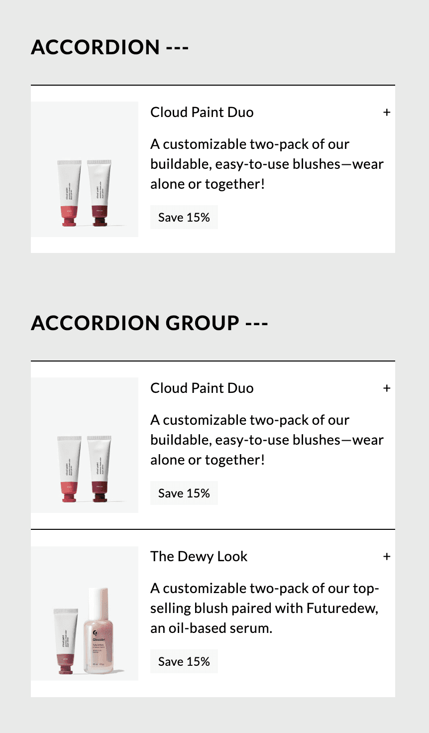
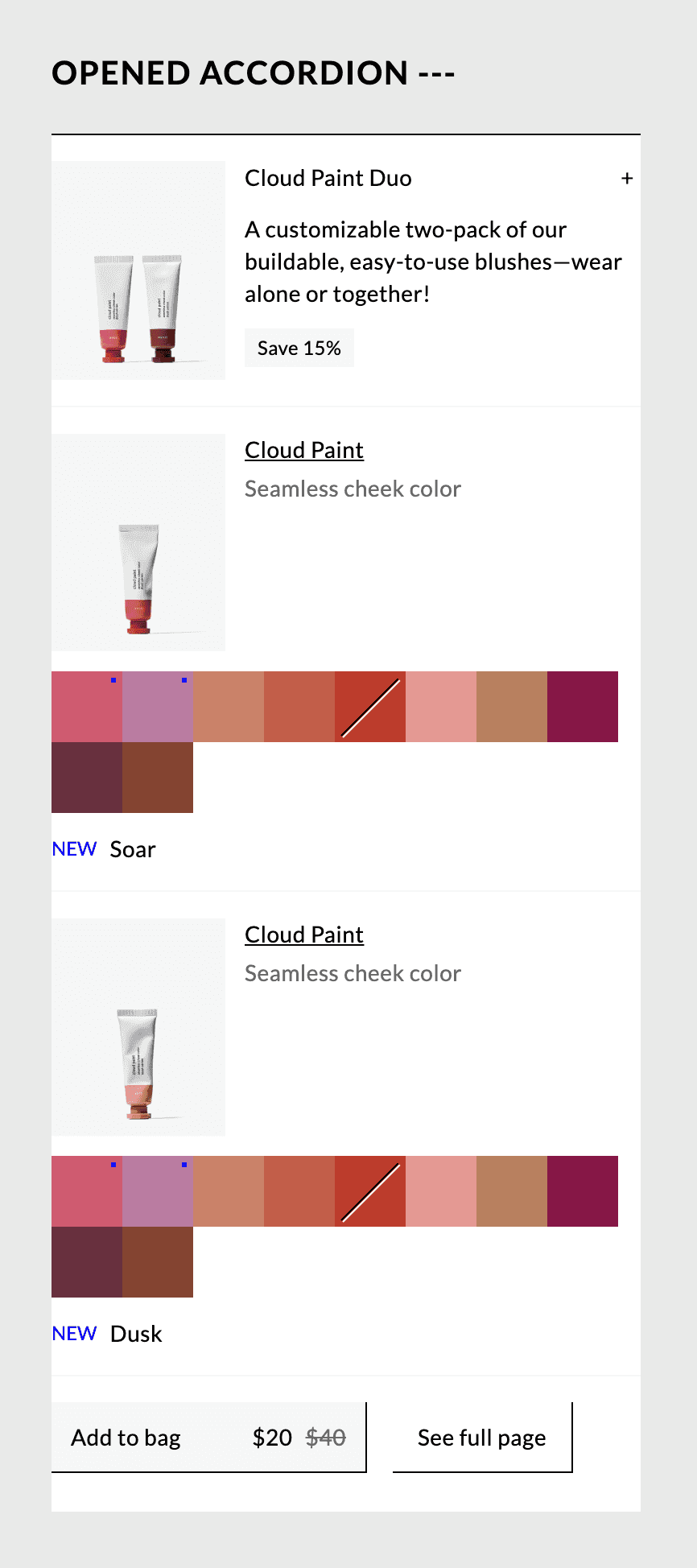
Several interaction enhancements remained unfinished and were identified as next steps:
Toggle between "+" and "−" when accordion expands and collapsesAnimate the icon toggleAnimate the expansion and collapse of the accordion contentUpdate the product thumbnail when color swatch is selectedRestrict selection to one color swatch at a time
Results
This project resulted in approximately 600 lines of HTML and 650 lines of CSS, with a working accordion component that mirrors the core interaction pattern of Glossier's Product Details Page.
Beyond the deliverable itself, the exercise deepened my understanding of flexbox and display properties, CSS specificity and class-based style overrides, and the practical implementation of design tokens across both design tools and front-end code. By approaching the build with the same methodical thinking I apply to design (auditing the system first, defining a structure, then building incrementally), I found the process far more manageable, which reinforced just how transferable a designer's instincts are in a development context.
This project demonstrated to me that the gap between design and development is not as wide as it may appear. With the right systems thinking, a designer can navigate a codebase with the same clarity they bring to a design file.