Tecovas Website Revamp
I led UX design for Tecovas' website revamp, achieving a 14% conversion increase, an 11% improvement in product page effectiveness, and a 40% jump in upsell/cross-sell sales.

Tecovas is a direct-to-consumer western footwear and apparel brand. Our team undertook an 8-month project to redesign the e-commerce website. Our primary objectives included the following:
1
Leverage new technology
I collaborated with developers and merchandisers to navigate new technologies: Hydrogen for frontend development and Sanity for e-commerce content management, ensuring seamless workflows.
3
Meet business metrics via improved UX
Increase conversion rate and average order value, etc. Decrease cart abandonment, return rates, etc.
3
Amplify Tecovas’ commitment to customer service
The digital experience needed to be akin to the exceptional customer service at retail stores, where visitors received complementary services and personalized shopping guidance in a warm and inviting retail atmosphere.
I led the design process from discovery to implementation, conducting competitive analysis, creating site maps, and handing off high-fidelity designs. Throughout the project, I collaborated closely with the Director of Digital Product, three engineers, another designer, and a project manager to ensure seamless execution.
By conducting weekly design reviews with the CTO and CMO and engaging with various departments such as e-commerce, creative, marketing, and customer success, I played a pivotal role in gathering cross-functional alignment on designs and propelling the designs forward.
After stakeholder interviews, synthesizing 100+ Baymard Institute articles, and a heuristic evaluation of the old site, I identified three key user pain points and one area of opportunity for the internal team.
B A S E L I N E
Tecovas' old website
Tecovas' old website was in need of a visual overhaul, UX improvements, and reevaluation of the information architecture.

S O L U T I O N 1
A user-centric product browsing experience that provides relevant information, fostering informed decision-making and streamlining the shopping experience.

Reduce "pogo-sticking"
New product card incorporates the right amount of information, enabling users to compare products while helping them decide if they want to click for more details. This decreases the need to bounce back and forth between the product listing and detail pages.
Boost buyer confidence
Fit Guide, along with product highlights and detailed technical specifications, equips users with essential information to make informed purchasing decisions. This prevents the users from leaving the page in search for information.


Lead with visuals
Grid layout of the product gallery spotlights the beautiful product photography. When it comes to buying footwear, consumers are enticed by lifestyle imagery and close-ups of the boots. Sometimes, a great photo can lead to an immediate conversion.
S O L U T I O N 2
To gain a better understanding of the design elements and key attributes that resonate with our customers when shopping for boots, apparel, and accessories, I executed the following:
1
User interviews
Conducted comprehensive stakeholder interviews with the footwear design and merchandising team.
2
Data analytics & competitive analysis
Delved into search term analytics and performed an in-depth competitive analysis of filtering experiences across various e-commerce platforms.
This research revealed distinct filtering needs based on gender and product category. However, due to timeline constraints, we focused our efforts on implementing the most essential filters first and followed up with additional filters after the launch.

S O L U T I O N 3
Personalized recommendations that foster product discovery and build user trust, rather than just being another transaction.
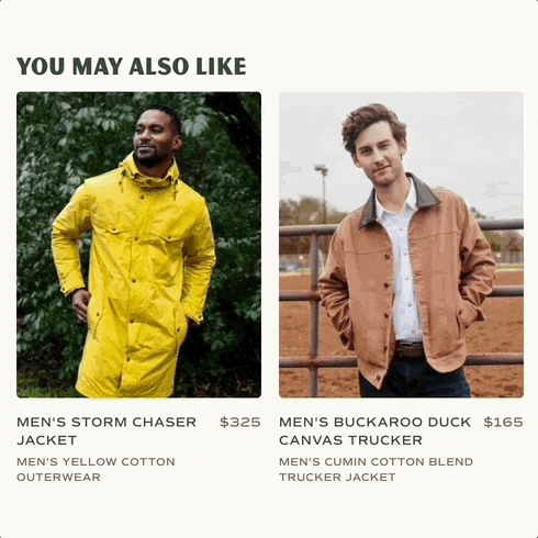
Find your favorites faster
Research indicated that users ignore a website's recommendations altogether if the items were irrelevant. The merchandising team curates the cross-sell section on the product detail page, while a third-party software recommends upsells in the cart.
Complete the look
Shoppers at the retail stores oftentimes bought the entire look off the mannequin. This feature works similarly by helping the user match boots with an outfit, helping the business drive sales.

S O L U T I O N 4
Streamlined workflows that improved team efficiency
Previously, a straightforward task like updating an image on the website could take up to two weeks due to communication gaps and workflow inefficiencies. By implementing these two collaborative workflows, various departments could complete cross-functional tasks more efficiently.
Component Glossary
Another designer and I created a comprehensive component glossary to help engineers decide when to reuse or create a component. It also allowed the creative, marketing, and merchandising teams to generate mock-ups for their presentations.


Sanity Studio Editor
We designs with a modular approach. In this way, merchandisers can independently create and modify modules without dependency on the engineers. I worked with the teams to identify customizable elements such as text, font styles, colors, and images.
Learnings ✴
Leading a major design project taught me that good collaboration require proactive effort. I learned the importance of building trust, adapting to diverse communication styles, and addressing interpersonal conflicts. Moving forward, I will apply these learnings to foster stronger cross-functional collaboration with future colleagues and clients. Teamwork makes the dream work!